
In the changing world of digital marketing, every element of your campaign plays a crucial role in shaping customer actions. Color is one element that is often overlooked and not taken full advantage of. Color is a powerful tool that can influence consumer psychology in many ways. In this article, we explore the truly captivating workings of the psychology of color in digital marketing. And present a few knowledgeable facts on how to harness the power of color in your digital marketing strategies.
Basics of Color Psychology
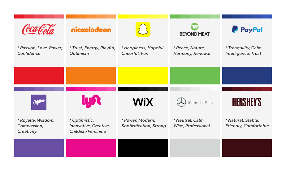
Color psychology is the study of how encountering different colors evoke specific emotions, moods, and reactions can evoke in people. Marketers have used this knowledge to select and apply specific colors in their branding, advertising and design to evoke special psychological responses in their consumers. This allows them to showcase their brands as more memorable and visually appealing. We present some examples of colors and their associated emotions;
- Red: Passion, Love, Urgency
- Green: Calmness, Growth, Nature
- Black: Noble, Sophistication, Power
- Purple: Luxury, Creativity, Mystery
- Blue: Hope, Trust, Peace
- Yellow: Cheerful, Joy, Danger
Leveraging Color In Digital Marketing:
There are many examples of successful brands that have a prominent use of color psychology in their branding. One example is Mcdonald’s, their use of yellow arches in the “M” showcases positivity and joy contrasted by the red in the background that is appetite-inducing. Their use of Happy Meals is another way to showcase the brand’s positive outlook and generates a happy association with their restaurant.
We will present some ways you can incorporate color schemes in your digital marketing strategies:
- Branding: Before the onset of digital marketing, businesses used colors as the prime source of enticing their consumers. By choosing the best colors that suited their brand values and resonated with their target audience. Using colors that reflect fundamentals of a brand such as using green and earthy tones to market eco-friendly products. Another example is the use of pastels and soft toned colors in the branding and advertising of skincare brands. You will notice most of skincare has a minimalist and sleek design with soft colors. One of the big reasons for skincare brands to use these colors is their association with freshness, relaxation and sophistication. These colors portray an aesthetic and emotionally resonant experience for your target audience and makes it more enticing for them.
- Calls to Action (CTAs): Use of contrasting colors for CTAs is proven to be attention-grabbing. For example, “Buy Now” or “Sale/Discount” signs are done in red to create a sense of urgency and encourage immediate action. The vibrant color also stands out and catches our attention.
- Background and Text: Using colors to ensure readability is also an important facet of successful digital marketing. A dark background with light text is a standard choice for most brands as it clearly presents the text.
- Color Grouping: By grouping a set of colors you can effectively set a structure and guide the attention of the users. An example would be color-coding a websites contents so that they appear coherent and clear.
These are just a few ways colors can play a big role in digital marketing strategies. However, one thing to be careful about when using color psychology are the cultural considerations and meanings of color in different parts of the world. For example, white is a color that is usually associated with purity in Western cultures, whereas, in Eastern cultures, it is seen as a sign of mourning.
Color rules for branding
Some other things we have to keep in mind while using color psychology are:
- Not using more than three colors in your brand design because it can be overpowering. However, there are some exceptions but this is a good standard choice to keep in mind. The simpler the better!
- Choosing the right color schemes to make an impact on your target audience. For example, monochromatic scheme, complementary, analogous etc. The right color scheme will trigger an emotional connection within your audience. So, make sure it is chosen with meticulous detail.
- Using the 60-30-10 rule for your design. This rule goes like this, use a primary color in 60% of the space, a secondary color in 30% of the space and if you have space for a third color, use it in the remaining 10% of your design. This is the best way of making sure your design is visually appealing and looks organised without the element of overwhelmingness from different colors.
- Making sure your color scheme is unique. It would be quite a hassle if you use a similar combination to your competitors. But, in the cases of not being able to pick uniqueness, the art of skilfully manipulating the colors is of utmost importance so that your brand stands out.
- Picking colors that are practical and stand out in all types of uses, such as in print or online. They should have the eye-catching and emotional elements in all uses.
Conclusion
Harnessing the power of color psychology in digital marketing strategies is a subtle yet rich way of connecting with your audience on a deeper level. Strategically implementing the right colors can influence consumer behavior and enhance brand recognition. Furthermore, the right color choices can make all the difference in the success of a digital marketing campaign; whether it’s using blue to convey trust, or red to create excitement. However, it is important to keep in mind that color preferences vary across cultures, so it is important to do thorough research. Ultimately, by leveraging the power of color psychology in digital marketing, marketers can create more effective and impactful campaigns.
To summarise, in this article we talked about the definition of color psychology and its basics with some key color examples and their emotional associations. We also presented the best ways to use colors in digital marketing strategies as well as some general rules to keep in mind when using colors in your branding or design. Keep in mind that the colors of a brand are one the first impressions a consumer has. So, it is important to think with an open mind and be creative.